← Journal
Realized Futures
What Does Co-Design Actually Look Like In Practice?
Lessons from Passport To Success, a global life skills training co-designed with the young women it serves.
Written by
Shannon Mitchell
I'm not the first to make the case for co-design. Research going back more than a decade has linked co-design to lower development costs, faster decision-making, and more original ideas.The challenge I've seen organizations face is that their commitment to co-design tends to waver as budgets and risks grow.
Counterintuitively, the larger the budget, often it seems the less comfortable teams become leaving choices up to users. Even with full commitment, co-design is hard to integrate at scale. How do you involve your audience at every step when that audience is spread across the globe and has widely varied preferences?
When GameTheory began working with the International Youth Foundation (IYF) on a project to reach millions of young women with career readiness and life skills training, delivered entirely digitally, we were grappling with these same questions. We all knew the product would only work if it was co-designed. Plus, we were planning to release in more than five languages and build hundreds of micro-lessons, so the scale of feedback we needed was daunting.
Over the two years of this project, we learned a great deal about what effective co-design looks like in practice. Here are some examples of how it played out, and how a similar approach can work for projects of any size.
Letting the Audience Set the Direction
We knew early on what material we wanted to cover. IYF had proven, effective curricula it had already delivered in person, and we were ready to translate them into a digital format. We also knew, with specificity, which audiences we wanted to reach. In India, for example, we were focused on young women in urban areas near city centers. Details like that told us which language to use, what tone of voice to take, and the general direction our localization would follow. What we didn't yet know was the context we would wrap around all of this learning: a rewarding, shared thread that could connect topics as different as gender and job interviewing.
Our first step into co-design was identifying five possible contexts that would localize well, support a range of learning objectives, and, we hoped, appeal to young women between the ages of 18 and 21. I, along with the team, facilitated a brainstorming session with stakeholders at IYF's headquarters in Baltimore to set the project's direction. By getting clear on the impact we wanted and collaboratively drafting personas that reflected our early ideas about who would ultimately use the product, we had enough to generate some exciting possibilities.
Those ideas ranged from alien planets to superheroes to creatures, or even just a simple real life setting. Because the context would shape the direction of the entire project, we wanted as much input on this decision as we could get. This was a case where the number of responses mattered more than their depth, so we designed a short, simple survey that would show us which contexts resonated and which were polarizing. Within a couple of weeks, hundreds of young people around the world had weighed in through IYF's social channels, and two contexts rose to the top:
Traveling the world and exploring different cultures
An idealized version of real life where you try out different jobs
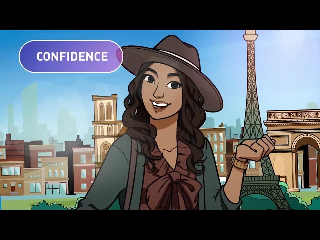
Since both ideas rated highly, we combined them into Passport to Success: Traveler, an e-learning course in which young people join an exclusive immersion program, traveling the world, meeting a mentor at each stop, collecting souvenirs, and trying out different jobs along the way.
This feedback was exciting for another reason: a travel context simplified much of our localization challenge. The question shifted from "How do we make this course feel familiar in any culture?" to "How do we accurately represent the cultures players visit as they travel?"
The Value of Prototyping
With the premise settled, we moved on to end-to-end mockups of the experience. Art was another major factor, so we developed a series of style samples and color palettes and tested them through a similar widely shared survey. The style that resonated most was colorful, almost like an animated princess film, with diverse characters, enough detail to show things like hearing aids or pins, and slightly larger eyes and more expressive features than a realistic style would allow.

Rather than finishing all of the art at once, we had the artists create sketches for each lesson so we could keep testing before the style was finalized and scenes were fully rendered.
With the context and art style in place, we turned to text, knowing text length and direction varies across the languages we planned to cover. We built a prototype lesson that pulled its content from an Excel spreadsheet, so multiple people could review and adjust it at the same time. We then sent that single lesson, a small slice of the experience, to the translation team.
The first round didn't land. The writing read as academic rather than casual and familiar to young people. Through that collaboration we also realized that we needed to target Hinglish rather than standard Hindi, and that we needed better support for right-to-left text for languages like Arabic. Because the lessons were built as games, that support didn't come out of the box and had to be custom built.
Borrowed Perspectives
For our alpha test, we strung together a selection of lessons into a custom demo that we could put in front of young people. Why only some lessons? First, it gave us a realistic amount of material to test in a one-hour session. Second, the courses and lessons reuse similar mechanics and structures, so a selection could still represent the full range of experiences.
We began focus testing with groups of 5 to 10 young people who played through the demo and then discussed their thoughts and reflections. These first tests took place in the U.S., which was easier to access and less expensive than traveling internationally. At this stage, the goal was to catch the main usability issues so the biggest problems would be resolved before we scaled up testing. To fill the gap left by the lack of international testing, we worked closely with cultural consultants who reviewed the games independently and gave feedback on the art style, early translations, and any contexts that felt risky. Even this early, we maintained every localized version of the tool. It didn't exist only in English, the development team's native language; it already ran in Spanish, Hinglish, and Arabic, among others.
We tested with dozens of groups over several weeks, and made sure that at least one member of the project team attended each session to observe how young people interacted with the tool and where they got stuck. If a participant ran into a bug, that team member could flag it right away so it was fixed before the next session.
We came away with a rich set of design requests from participants and ranked each issue by how much it affected the experience and how much it mattered to the people we heard from. At that point, we felt confident moving forward: fully rendering the art, refining the text and language, adding animation, and filling in the gaps.
When Design Becomes a Conversation
With the beta version ready, we moved into our largest and most critical round of testing, this time internationally. I flew to New Delhi and Bangalore to test alongside young women who would be using the tool and who were excited about its release. With the help of excellent interpreters, we replicated our earlier process: small groups played through the course, then talked through their impressions.
Nothing could replace being in the room with these young women and hearing their reactions directly. This is the heart of genuine co-design. Design becomes a conversation, where I can ask, "If we changed it this way, how would that feel?" and weigh the ideas participants share about where they'd like it to go. These sessions led to a number of iterations, from new outfits to new mini-games. We also discovered that the phones we had been using for quality assurance (QA) weren't common in these regions. Before leaving, I arranged to have several of these phones purchased and shipped home so we could continue testing on them.
Co-Design Continuously
Co-design is an ongoing conversation, not a single workshop or focus group. The circle of people you co-design with should grow as your product does, and as you approach release, you should be involving more people in more ways.
Co-design also means considering all of your users from the start. If you can't yet put your tool in front of certain users, work with experts or cultural consultants who can bridge the gap until you can.
It requires real humility: taking something you've spent years building and poured enormous thought into, putting it in front of someone new, and genuinely learning what would make it work for them. That willingness to learn is where much of the value comes from.
Finally, it should go without saying, but compensation is an essential part of co-design. The young people we worked with were designers as much as testers, and we made sure every person who participated was paid for their time. I still credit them as a major reason this product succeeded.
More than 1,000 young people across eight countries tested Passport to Success: Traveler before it launched, and these perspective guided the process at every stage. Traveler launched in four languages and has since grown to cover 8 languages, with thousands of young women using the course to build their futures. It has expanded into new programs, such as one in South Africa that connects learners who complete nine or more units to internship and learnership opportunities.
This co-design process led to the course becoming an international success, earning the Brandon Hall Group Gold Medals, starting with Best Advance in Social Impact Innovation in 2020, the mEducation Alliance Award for Youth and Workforce Development, and then later an additional Brandon Hall gold medal for excellence in technology and learning.